Aligning a Legacy Design System with Salesforce Lightning Design System (SLDS)

Aligning a Legacy Design System with Salesforce Lightning Design System (SLDS)

CASE STUDY - DESIGN SYSTEM

CASE STUDY - DESIGN SYSTEM

At Tech Mahindra, I contributed to a design system modernization initiative for a European telecom client's Salesforce-based call centre platform. My role involved:

Reviewing 38 legacy UI components against Salesforce Lightning Design System (SLDS).

Developing component-level recommendations in collaboration with a Senior UI Designer.

Presenting proposals to the Client Design Lead for review and approval.

Documenting approved component standards, usage guidelines, and implementation best practices for designers and developers.

Project Overview

Role

UX/UI Designer

Scope

Review & standardize 38 legacy UI Components vis-a-vis SLDS

Approver

Client Design Lead

Platform

Salesforce-based Telecom Agent Contact Centre

Collaborators

Senior UI Designer, UX Designers & Developers

Contribution

Component recommendations, Guidelines and Usage documentation

Collaborators

Senior UI Designer, UX Designers & Developers

Contribution

Component recommendations, Guidelines and Usage documentation

Context

Background

The European telecom provider was modernizing its Salesforce-based call centre platform by aligning its legacy design system with Salesforce Lightning Design System (SLDS). Every legacy UI component was reviewed, standardized, and documented to create a consistent design foundation across the application.

Primary Users

Call Centre Agents

  • Manage customer accounts

  • Process service requests

  • Resolve issues

  • Complete transactions efficiently

Design Challenge

The transition involved more than updating the visual appearance of components. The challenge was to:

Align legacy components with SLDS standards.

Preserve existing business workflows.

Create documentation that designers and developers could refer confidently.

Ensure consistency across future product releases.

My Contribution

As a UX/UI Designer in this project, I contributed to the design system modernization initiative through two key workstreams.

1

Design System Documentation

  • Reviewed 38 legacy UI components with SLDS.

  • Documented component specifications, behaviours, usage guidelines, and implementation recommendations.

  • Presented proposals for review by a Senior UI Designer and the Client Design Lead.

  • Incorporated feedback and finalized approved documentation.

  • Created a standardized reference for designers and developers.

2

Enterprise UI Implementation

  • Recreated selected transactional screens using approved SLDS components.

  • Applied standardized layouts, typography, spacing, and interaction patterns.

  • Collaborated with designers and developers to validate implementation.

  • Supported iterative design reviews throughout the project.

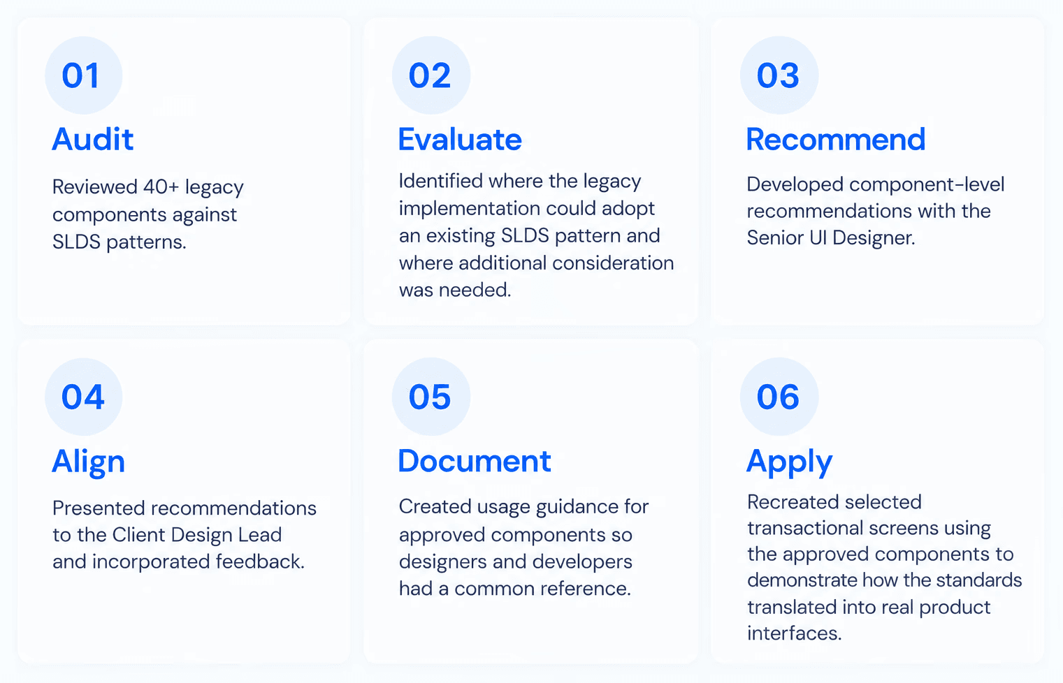
Component Review and Standardization Process

Following process was repeated across 38 enterprise UI components, creating a standardized reference for future interface development.

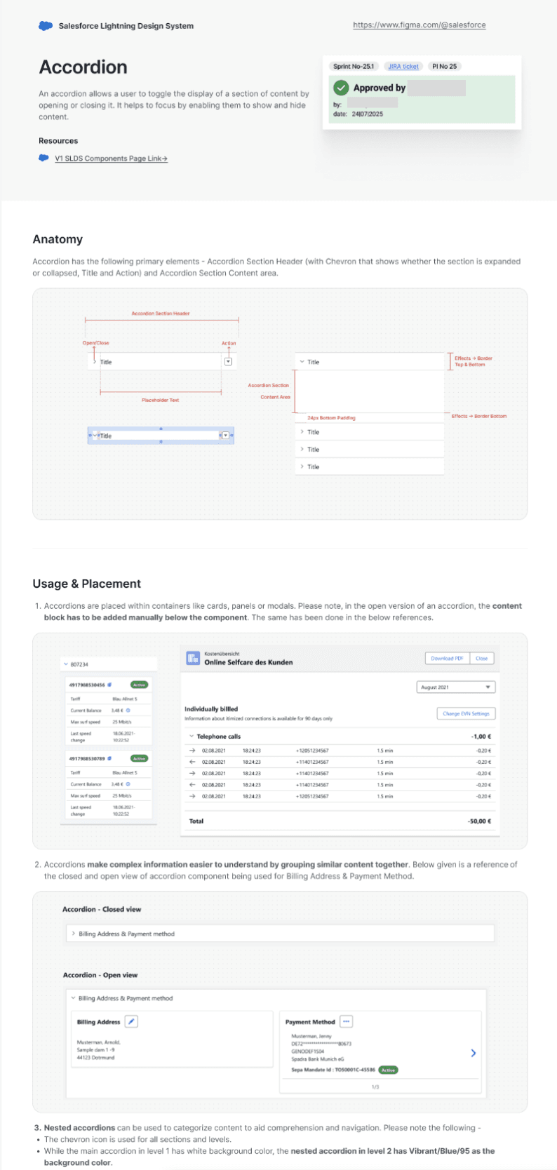
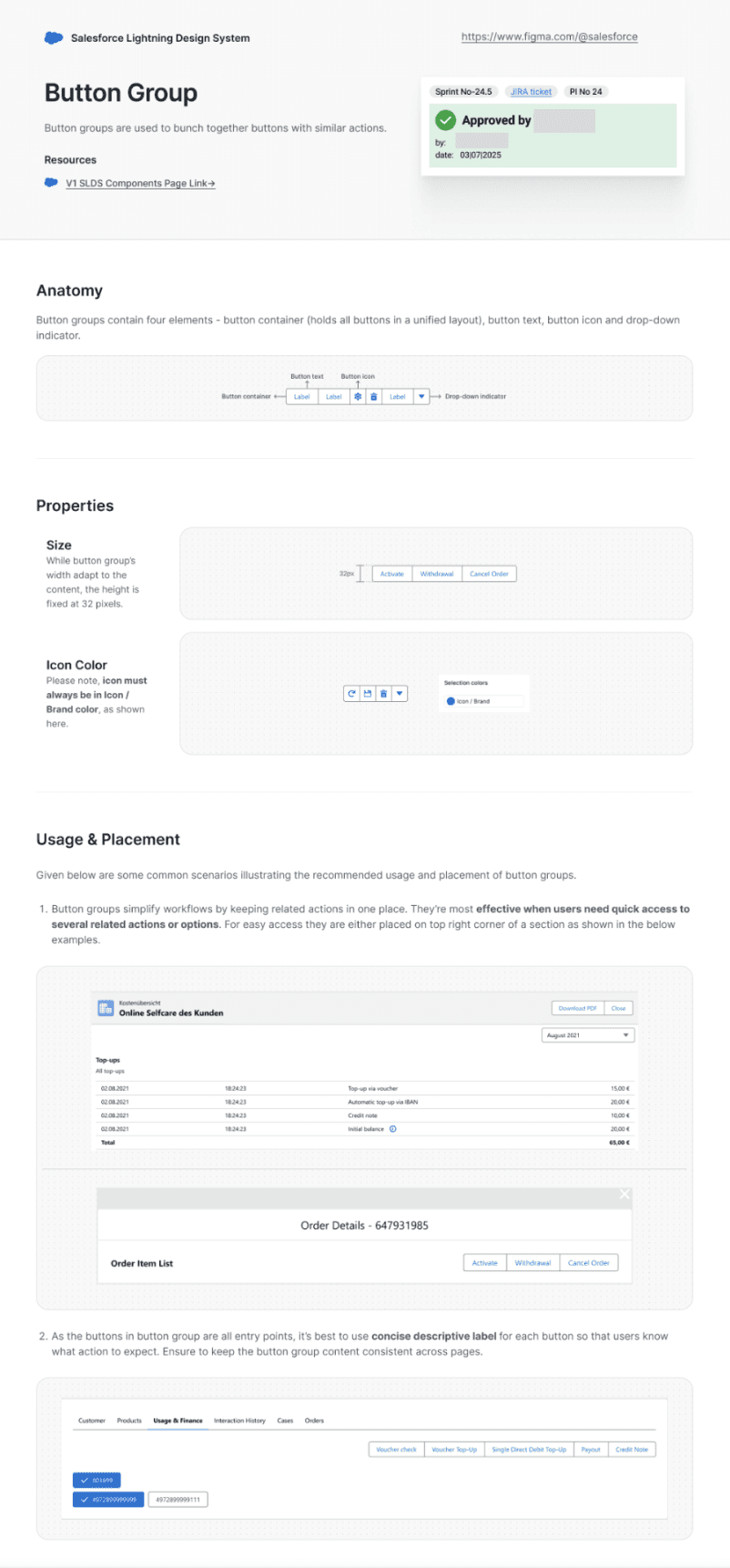
Documenting Approved Components

Here's a glimpse of few approved components - Accordion, Badge, Popover, Tabs, Button Group and Visual Picker. Each component documentation includes -

  • Anatomy

  • Properties

  • Usage & Placement (Legacy vs SLDS)

  • Do's and Don'ts


Note: To maintain confidentiality, all names and identifiable references have been intentionally obscured throughout the instances below.

Applying the Approved UI Components in Agent Screens

Following approval, the standardized components were applied across transactional workflows to improve consistency and implementation readiness. I recreated selected transactional interfaces using the approved component library.

Screen 1 - Transaction List View


Purpose -

Designed a structured list view using standardized components to support efficient navigation of customer orders and service requests.


Applied Components -

  • Global Header & Navigation

  • Tabs

  • Input Field

  • Data Table

  • Accordion

  • Badge

Screen 1 - Transaction List View

Purpose -

Designed a structured list view using standardized components to support efficient navigation of customer orders and service requests.


Applied Components -

  • Global Header & Navigation

  • Tabs

  • Input Field

  • Data Table

  • Accordion

  • Badge

Screen 2 - Order Item List Modal

Purpose -

Recreated a transactional modal using approved SLDS-based components to validate the standardized design system.


Applied Components -

  • Modal

  • Scoped Tabs

  • Data Table

  • List Box

  • Button

Screen 3 - Order Information Workspace

Purpose -

Applied approved components to organize detailed order information within a scalable enterprise workspace, improving readability and maintaining consistency across high-volume transactional data.


Applied Components -

  • Global Header & Navigation

  • Scoped Tabs

  • Data Table

  • Buttons

  • Input Fields

Screen 2 - Order Item List Modal


Purpose -

Recreated a transactional modal using approved SLDS-based components to validate the standardized design system.


Applied Components -

  • Modal

  • Scoped Tabs

  • Data Table

  • List Box

  • Button

Screen 3 - Order Information Workspace


Purpose -

Applied approved components to organize detailed order information within a scalable enterprise workspace, improving readability and maintaining consistency across high-volume transactional data.


Applied Components -

  • Global Header & Navigation

  • Scoped Tabs

  • Data Table

  • Buttons

  • Input Fields

Key Outcomes

Learnings

CCG - Enterprise design systems succeed through consistency, collaboration, and governance, not visual design alone.

CCG - Enterprise design systems succeed through consistency, collaboration, and governance, not visual design alone.

CD - Clear documentation reduces ambiguity and improves implementation quality for both designers and developers.

CD - Clear documentation reduces ambiguity and improves implementation quality for both designers and developers.

DR - Design reviews with senior designers and client stakeholders strengthened my understanding of enterprise design workflows.

DR - Design reviews with senior designers and client stakeholders strengthened my understanding of enterprise design workflows.

Reflection

Coming from a communications background, this project enhanced my perception about design. I learned that enterprise UX is not only about creating interfaces, it is equally about building shared standards, documenting decisions, and collaborating across teams so products remain consistent as they evolve - similar to the practices being followed in communications and branding.


Working on this initiative strengthened my interest in design systems and scalable enterprise experiences.

Next Steps

In an ideal world, I would have liked to have the time to -

  • Validate updated components through usability testing with call centre agents.

  • Conduct accessibility reviews against WCAG standards.

  • Measure task completion, efficiency, and error rates after implementation.

  • Refine component guidelines based on user and developer feedback.

"Design systems are not just about components. They are about building a shared language that enables consistency, collaboration and smooth user experiences at scale."

View More Case Studies

Building enterprise products that people can actually use.

Have a project or opportunity in mind?

Let's Connect

Bangalore, India © 2026 Suneha Sen

Building enterprise products that people can actually use.

Have a project or opportunity in mind?

Let's Connect

Bangalore, India © 2026 Suneha Sen

Building enterprise products that people can actually use.

Have a project or opportunity in mind?

Let's Connect

Bangalore, India © 2026 Suneha Sen

Project Overview

Platform

Salesforce-based Telecom Agent Contact Centre

Role

UX/UI Designer

Scope

Review & standardize 38 legacy UI Components vis-a-vis SLDS

Approver

Client Design Lead

Collaborators

Senior UI Designer, UX Designers & Developers

Contribution

Component recommendations, Guidelines and Usage documentation